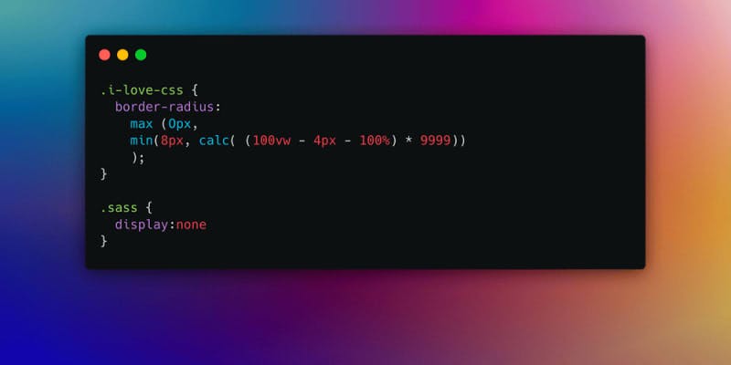
Goodbye SASS 👋, welcome back native CSS

Sass has established itself as a powerful preprocessor installed locally, forming the backbone of my projects for over a decade. It enabled me to efficiently organize scalable and stable CSS packages. Even today, I still consider Sass to be an extraordinarily powerful tool. Yet, as we step into the year 2024, it's undeniable that CSS has undergone rapid development. Features that were once unique to Sass are now natively integrated into CSS, including variables and the latest highlight: CSS Nesting.
Variables
Defining variables was long seen as a unique strength of SCSS, allowing for the centralized management of many properties, a feature sorely missed in CSS for a long time. Today, however, variables can also be defined in CSS in a manner similar to Sass. A significant difference, however, is that Sass variables exist exclusively within the preprocessor context, while CSS variables can be used in the browser and even dynamically overwritten via JavaScript.
:root {
  --button-padding: 10px 20px;
  --button-bg-color: #007bff;
  --button-text-color: #ffffff;
  --button-border-radius: 8px;
}

.button {
  padding: var(--button-padding);
  background-color: var(--button-bg-color);
  color: var(--button-text-color);
  border-radius: var(--button-border-radius);
  border: none;
  cursor: pointer;
  transition: background-color 0.3s;
}
CSS Nesting
The ability to define the style rules of one element within another significantly simplifies writing CSS. Instead of repeatedly using the same selector for subordinate elements or pseudo-selectors, nesting allows grouping these within a parent selector. This technique leads to a clear, hierarchically structured, and thus more efficient codebase.
With browser support of over 84% for CSS Nesting and 86% for the Nesting Selector, this technique is becoming increasingly accessible.
.blog {
  position: relative;
  padding: 1rem;
  background: var(--neutral-100);

    .blog-item {
      border: 1px solid var(--neutral-200);

      & span {
        font-size: 1rem;
      }
  }
}
The :is Pseudo-Class
The :is pseudo-class revolutionizes the selector concept by accepting a list of selectors and styling all elements that match any of these selectors. This greatly facilitates the selection and styling of elements in the DOM.
:is(selector1, selector2, selector3) {
  /* styles */
}
Instead of long selector lists, you can use :is() to improve readability while avoiding a long selector.
The : has() pseudo-class
The CSS pseudo-class :has() provides a powerful way to select an element based on its descendants, similar to the application of conditional styles.
.hero:has(.hero-button) {
  background-color: var(--accent-50);
}
Container queries
Container Queries are considered the most significant innovation in web design since CSS3. They expand the concept of Responsive Design by allowing elements to adjust based on the size of their containers. This technology enables the design of an element to dynamically change depending on the context, leading to a more flexible and adaptive design.
.component {
  --theme: dark;
  container-name: fancy;
}

@container fancy style(--theme: dark) {
  .fancy {
    /* dark styles. */
  }
}
.parent-container {
  container-type: inline-size;

  .headline {
    font-size: 2rem;
  }

  @container (width >= 720px) {
    .headline {
      font-size: 2.5rem;
    }
  }
}
If the container fancy have the variable --theme: dark, add the following CSS.
Cascade layers
With cascade layers, we can avoid the nesting of classes, IDs, etc. for higher specificity by assigning our own layer (layer). Using the @layer at-rule and layered @imports, we can build our own layers of the cascade - from low-priority styles like resets and defaults, through themes, frameworks, and design systems, to the highest priority styles like components, utilities, and overrides. Cascade layers provide more control.
@layer utilities {
  .button {
    padding: 0.5rem;
  }

  .button--lg {
    padding: 0.8rem;
  }
}
Future of SASS
Does this mean Sass has become obsolete? Not at all. Mixins and functions, such as the conversion of pixels to rem, remain irreplaceable advantages of Sass. Nevertheless, I have decided to forego Sass for most of my projects. Instead, I use predefined code blocks and packages in my Sublime Editor, which has significantly improved my workflow.
Goodbye SASS?
I truly believe that in 2024, the benefits of Sass, including installation, usage, and compilation issues, no longer justify its use. The scalability and user-friendliness of modern CSS make it possible to do without additional tools.
My Themex project demonstrates how powerful the combination of new CSS features can be: https://app.themexproject.com
With the advancement of CSS, I look forward to implementing small and large projects directly and straightforwardly.
Goodbye Sass, and thank you!
GIF